GTM North.
The room.
On the web.
Real conversations, a recognisable design language, and a journal built around the questions Canadian operators ask.
Visit GTM NorthA little edge.
Everywhere.
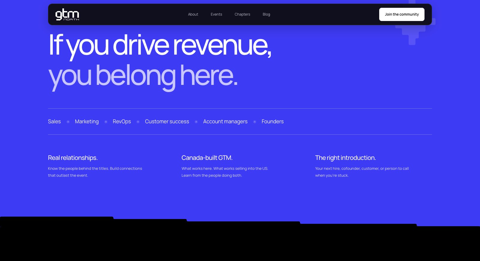
The stepped geometry of the GTM North wordmark becomes a language for the whole site: section transitions, media frames, small directional symbols and the closing invitation.
A recognisable rhythm
Near-black, warm white and electric blue. Generous type and deliberately stepped edges give the community its own visual signature.
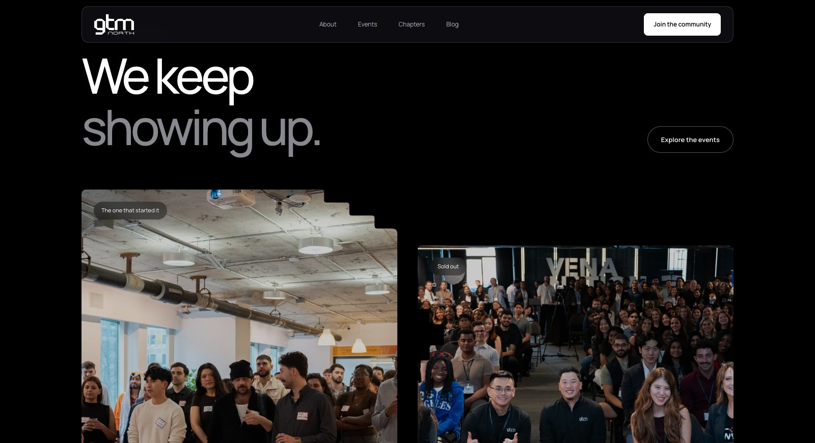
People before promises
Event footage opens the site. Member interviews and photographs show who is actually in the room, before asking anyone to join.
Room to grow
Dedicated events, chapters, partners and founder pages turn the homepage into an entrance to the community.
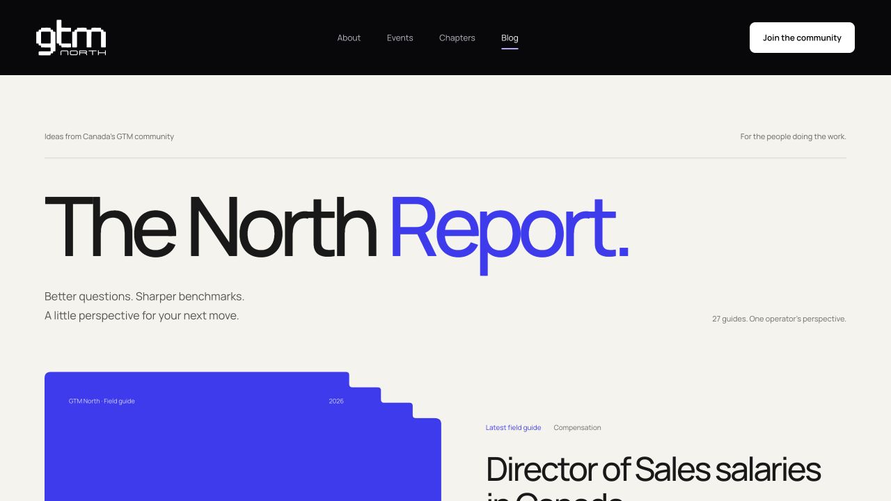
A journal with
a structure.
27 guides, organised into compensation, community, GTM strategy and events. Each topic has a home; each article has a clear path into the next one.
Built for the reader.
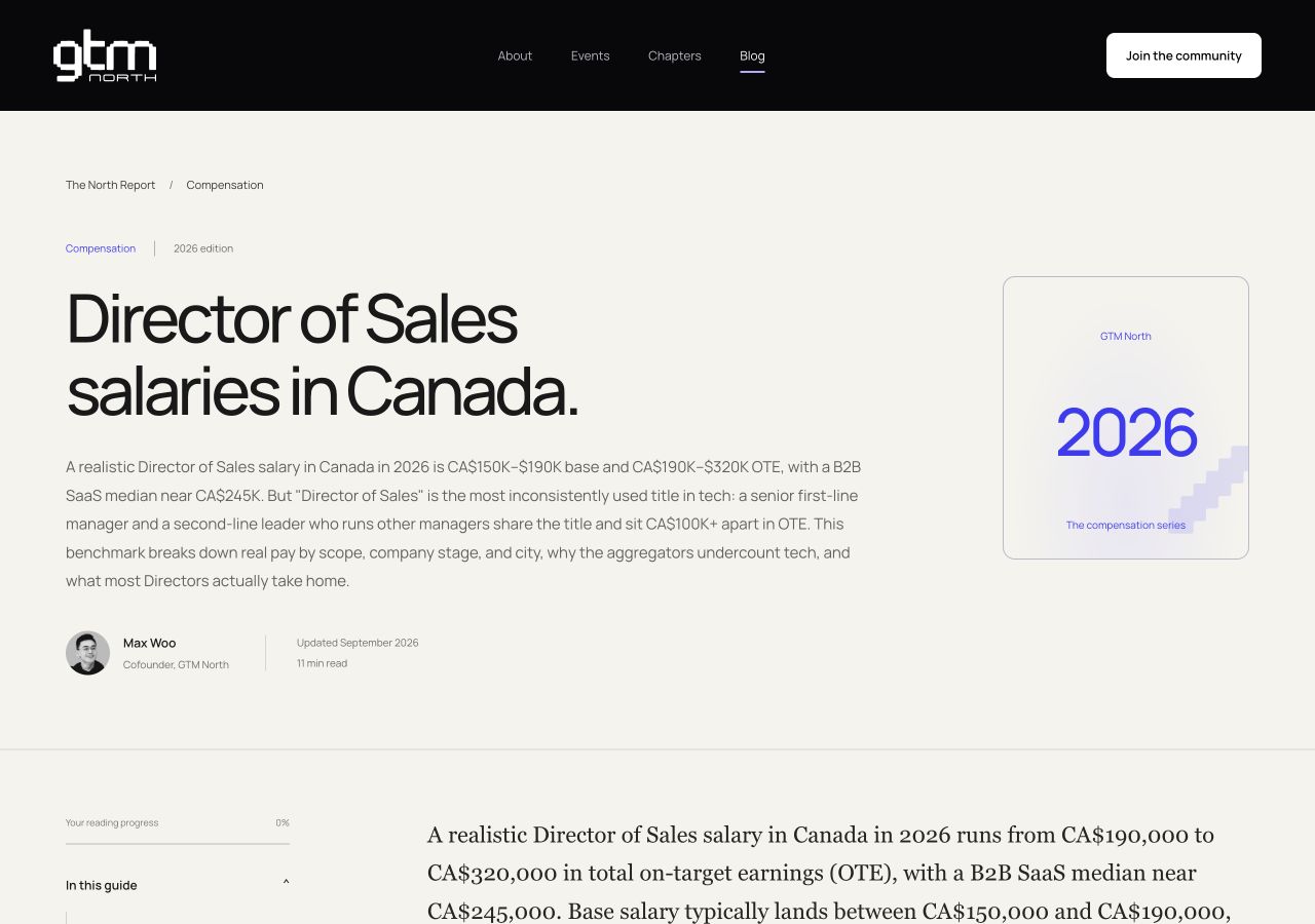
- Answer-first introductions and salary tables.
- Author profiles, edition dates and reading times.
- A contents rail with reading progress.
- Copy, print, share and AI citation links.
- Related reading organised by topic.
Built to be understood.
Article, author, breadcrumb and FAQ structured data connect the content. Topic hubs, an RSS feed and a plain-language AI facts page make the library easier to discover and reference.
Explore The North ReportThe community
is the material.
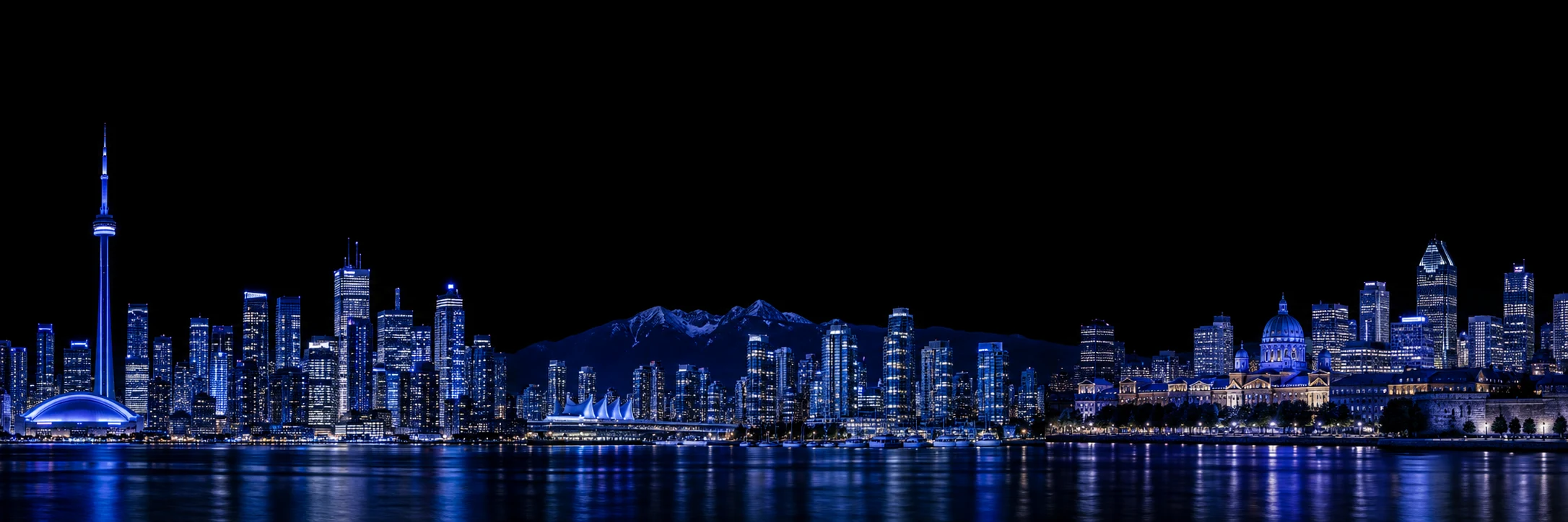
We built with the assets that make GTM North specific: event footage and photography, member interviews, founder portraits, partner marks and a Canadian skyline.

Moving image
A cinematic opening, event films and short member interviews, with previews that keep the page light.
People & partners
Founder portraits and sponsor marks sit alongside the event archive, giving visitors names and faces to recognise.
Editorial identity
Typographic article covers, city and role labels, and consistent sharing images give the journal a life beyond the homepage.