

The old spaceandstory.co was a portfolio piece for designers. It had a gradient hero background you could lose an afternoon staring at, an italic Playfair display headline that scrolled past in a marquee, an "AS FEATURED IN" badge row that wasn't featured anywhere outside of our own imagination, and a positioning line I'd written down with a straight face: Prize-winning digital studio focused on AI-ready infrastructure. The hero copy promised, in title case, that we'd help you stand out and make all your dreams come true. The pricing started at $10K and went up from there. Looking at it now, eight months after we shipped it, the kindest thing I can say is that it was a fun build.
That site lived for about a year. In that year it generated a meaningful amount of design admiration from peers, a handful of intro calls, and roughly zero clients who hired us off the homepage. The clients we did sign came from referrals, from outbound, from working group calls where the studio site barely came up. The site sat on top of a sales motion that worked despite it rather than because of it.
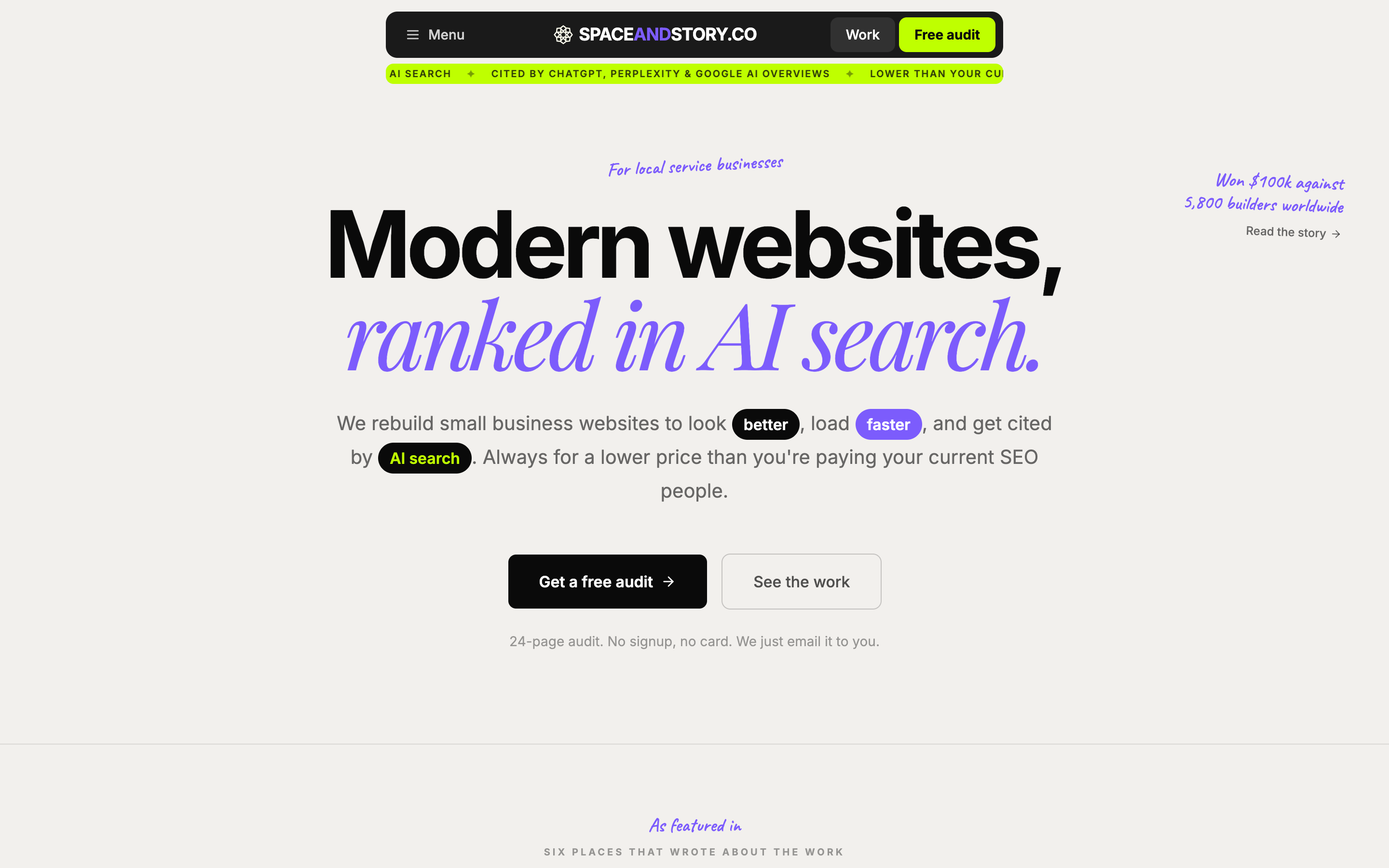
So we rebuilt it. Same studio, same case studies, same $100K from Lovable Shipped, with a different framing and a much smaller pricing floor. Say hello to the new spaceandstory.co.
What the old site was doing instead
If you've spent any time on Awwwards or SOTD lately, you've seen the patterns the old site borrowed. A scroll marquee in the hero, big italic display type in a serif, gradient washes that shift colour as you scroll, sticky badge rows announcing imaginary press coverage, oversized cursor blobs that follow the mouse around. I'd spent years collecting those sections, prototyping them in Figma at midnight, and then porting them into production sites because they looked good in screenshots and showed off the engineering. They were technically impressive, and load-bearing for exactly nobody who was thinking about hiring a studio for a website.
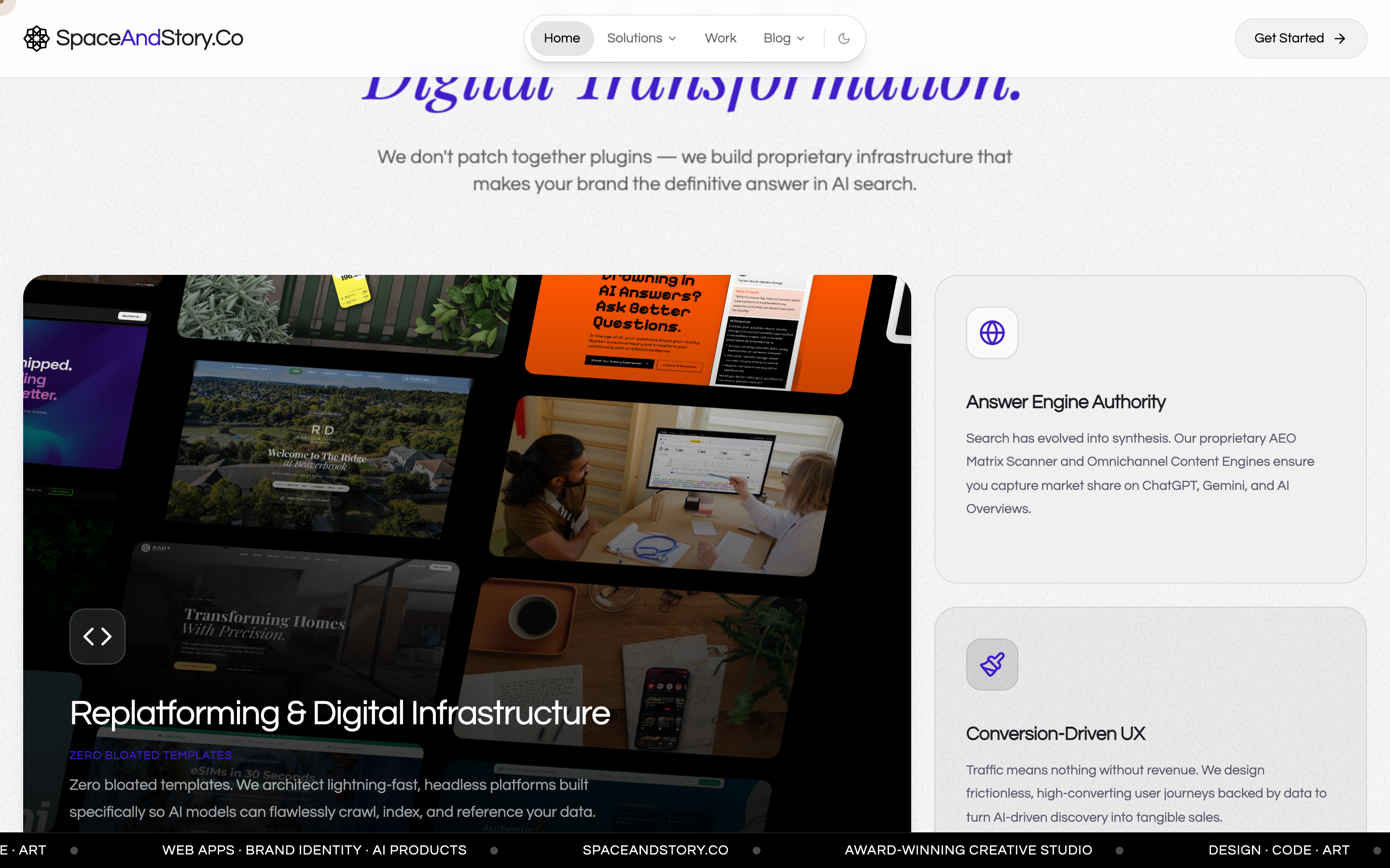
The honest read, which took me longer than it should have to admit out loud, is that small business owners do not care if your hero section uses a custom GLSL shader. They care if you can tell them how many leads the site will bring in next quarter, what it will cost, and how long it will take. The marquee was answering a question they hadn't asked.
The other thing the old site was doing, which is worse, is borrowing language from a tier of buyer I wasn't really selling to. The hero line was the giveaway.
Prize-winning design. Optimized for every search.
That phrase sounded great at a startup mixer. It sounded weird on a discovery call with a dentist who runs three clinics in Mississauga. Enterprise replatforming starts at $10K read as a polite "please leave" to most of the buyers who were walking into my pipeline. They'd close the tab and email me anyway, but the site was working against the conversation rather than for it.

What we changed
The new spaceandstory.co leads with the ethos in one breath, the way I'd say it in person if someone asked me what the studio does. Better website, more accessible to your audience, more pages with current content, more discoverable by AI and search. Always cheaper than the SEO bill you're paying now. That's the line. There's no italic Playfair behind it and no gradient washing through. Just the sentence, sitting where the marquee used to be.
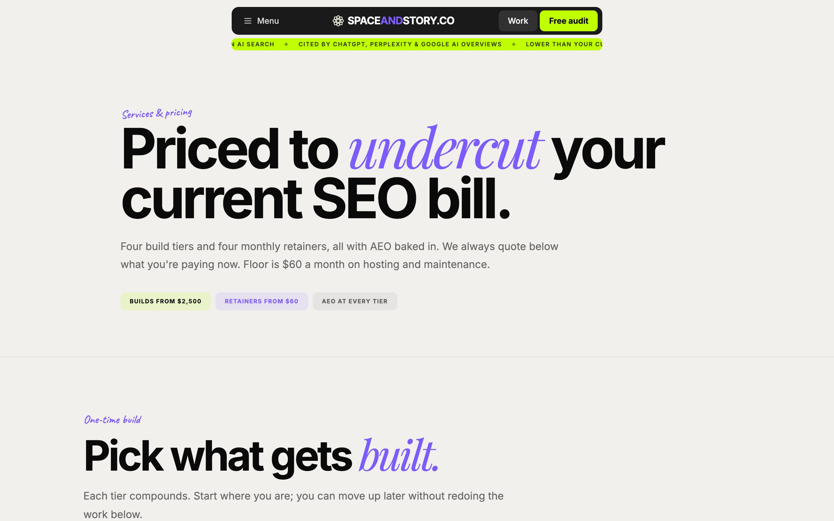
Pricing is in the hero, which I had to convince myself to do twice. Site at $2,500, Story at $5,000, Engine at $9,000, Studio at $15,000+. The numbers are smaller than the old ones because the ICP is smaller. Local service businesses run on smaller budgets than Series B AI scale-ups, which is who the old site was performing for. Hiding the numbers behind a "contact us" link was costing us the conversation; putting them up front turns the homepage into a qualifier.
The case studies are still there. Zebra Cinema, Starlit Homes, IDA, Voltra, Cannabislink, Bosco, the whole roster. The framing around them shifted. Instead of "award-winning design for ambitious brands," the cases sit under a sentence that says, in the same plain register: here is what we built, here is what it cost, here is what it did for the business afterward. The case studies always carried the weight. The old design was the part that was getting in their way.
The wedge offer is the part I'm proudest of, because it took us nine months of generous-GTM practice to get the math working. The free AEO and Lighthouse audit at spaceandstory.co/audit is the single line on the homepage that I'd defend as a complete strategy on its own. We run a free audit on a prospect's site, the audit produces a 24-page PDF with real findings, and the audit doubles as a sales asset because it surfaces exactly the problems our Engine and Studio tiers fix. Half our pipeline now comes through that wedge. The other half comes from referrals and from the open-source methodology, which leads me to the next change.
What's open now that used to be locked
The methodology is open source. The five Claude Code skills we run the studio on (audit, brief, copy, build, post-launch QA) are at github.com/MahmoudHalat, MIT-licensed, with the same prompts we use in production. The framework underneath all of this is at mahmoudhalat.com/marketing-os, with 280+ primary sources, CC-BY 4.0. The studio plays its work in the open: the case studies are live URLs, the prompts are public, and any prospect who wants to read the exact frameworks that will touch their content can do that before signing anything.
I made the open-source choice partly because I'd rather a useful methodology be public than mine, and partly because the lift-and-shift risk turned out to be smaller than I'd imagined. If a competitor wants to copy the skills and try to run the studio off them, the skills turn out to be the easiest part to copy and the hardest part to use well, because the judgment underneath the prompts is what compounds and the prompts themselves are scaffolding. Open-sourcing the scaffolding doesn't give away the building.
What didn't change
The receipts are the same. The decade at Verto, the $100K from Lovable Shipped, the 30+ projects shipped across fintech and real estate and healthtech and education, all of it still in place and still where it was. What I'd been over-engineering was the framing around those receipts. The new homepage doesn't lead with the prizes; it leads with the offer, and the receipts sit in a credibility block lower down where they belong.
The voice on the site is also the same as it was in the case study writeups all along, which I'd been hiding behind the maximalist design treatment. Reading the old site and the new one side by side, the words underneath the gradient hero were already in the right register. The new design just got out of their way.
Who this is for
If you run a dental practice, a law firm, a contracting business, a dispensary, a home builder, a custom installer, or a real estate team, and your current website is costing you more in SEO fees than it would cost to rebuild it, the new site is talking to you. The Site tier ($2,500) is for the operator who wants a working homepage with two service pages and a contact form. The Story tier ($5,000) adds the case studies and the content layer. The Engine tier ($9,000) is the AEO-ready build with the audit baked in, which is the tier most of our 2026 pipeline ends up sitting in. Studio ($15,000+) is the full thing.
If you're at a Series B AI scale-up looking for an enterprise replatforming partner, this isn't the studio for you anymore. We can still do that work and we will quote it. The homepage just stopped pretending that buyer was the centre of the universe.
What we built next: a hub for every industry we serve
The same week we pulled the gradient hero down, we shipped thirteen industry hubs at /for/{slug}, one for every ICP in the list above: dentists, lawyers, contractors, real estate, home builders, AV installers, accountants, fitness studios, vets, boutique retail, auto repair, restaurants, schools. Each hub runs the same shape underneath (industry-specific hero, a five-card pain stack, a what-we-ship section, tier scoping written for that industry's economics, a case study or an honest analog, a why-us block, an FAQ, and the free-audit CTA), with the surface copy tuned line by line to the way operators in that industry actually talk about their websites. Underneath the hubs sit a cost spoke for every ICP and per-city programmatic pages for the geographies where we already have studio reach. Roughly two hundred and eighty new indexable URLs, sixty-four thousand words of original copy on the hubs alone, before the per-city depth adds its own layer on top.
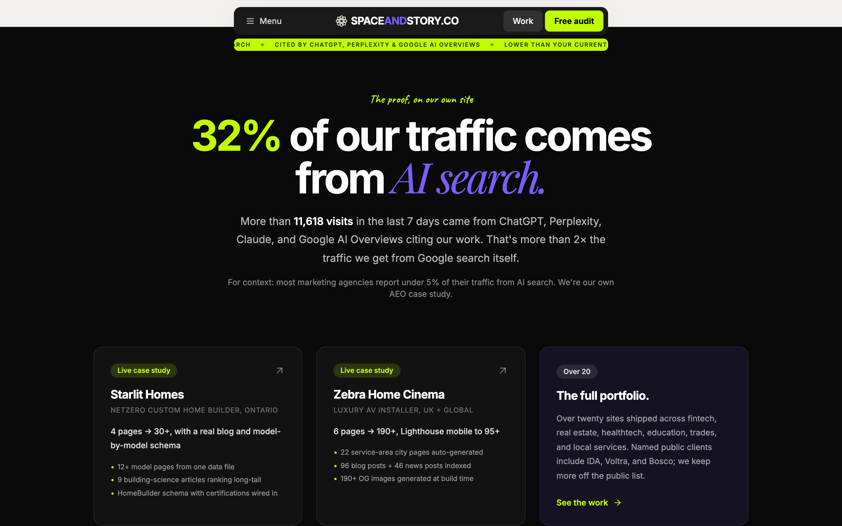
The reason we built this in May rather than waiting until Q3 is that AI engines cite industry-noun queries far more readably than they cite generic studio queries. A prospect asking ChatGPT for a modern dental website or a custom home builder in London ON or a plumber in Mississauga is going to get cited a hub page that names the industry in the H1 and carries the right schema (Dentist, HomeBuilder, Plumber, Restaurant, the relevant LocalBusiness subtypes) rather than a homepage that talks about studio philosophy. The studio's own cite-met.com data shows that thirty-two percent of our incoming traffic now comes from AI engines rather than classical search, and the bet behind the hub rollout is that the same pattern compounds for our clients when we ship per-industry per-city depth underneath their domains.
The honest part, which I'd rather name out loud than have a sharp prospect catch on a call: we have killer case studies for two of the thirteen verticals today. Starlit Homes is the proof for home builders (the 12 building-science articles, the HomeBuilder schema with NetZero certifications wired in), and Zebra Home Cinema is the proof for AV installers. The other eleven ICPs ship with what we call the honest analog framing, which sounds something like we haven't shipped a dental site yet, but the same model that ranked Starlit's twelve building-science pages will rank twelve procedure pages the same way. The receipt under the analog is the part that matters: my decade of healthcare informatics at Verto (where a quarter of Canada's daily COVID doses ran on the scheduling platform I helped build) is the schema-fluency proof for the regulated verticals, and the same decade is the proof scaffold for any financial-services ICP where the buyer's first question is going to be about credentials.
If you're in one of the thirteen, the entry point is the hub for your industry. /for/dentists is the one I'd suggest reading first, even if you don't run a dental practice, because the shape is the same across all thirteen and the dental hub is the one we tuned hardest before we shipped the rest. From there, the free audit is the same wedge it's always been, except now the deliverable lands you on the industry-specific page when you click through rather than the generic studio site.
What's next in this series
This is the first of three posts on the redesign. The next two go deeper on the pieces I'm proudest of:
- The Generous GTM Playbook: how we close deals at Space & Story, which walks the rule of the house, the six-step workflow, the bundling math competitors charge separately for, and the Starlit Homes deal day by day. The free 24-page audit is the wedge that does most of the work the homepage used to be pretending to do.
- Why our methodology is on GitHub (and your agency's probably isn't), which covers the five open-source Claude Code skills, the three quality gates every piece of content runs through before it ships, the 280+ source Marketing OS, and why open-sourcing the scaffolding doesn't give away the building.
If you want to see what the new site changed in practice, the place to start is the free audit. We'll run your site against the AEO checklist and the Lighthouse battery, send you a PDF with real findings, and you can decide whether the studio is worth a conversation. The solutions page is where the four tiers live with everything that's bundled at each level (the original copywriting is included, the rebuild on AEO-ready infrastructure is included, the post-launch handoff is included). The case studies are where the receipts live.
The old site comes down at the end of this month. I saved a copy of the hero section for the archive, because some part of me will miss the gradient. The new one is the studio I want to be running for the rest of the year.