Most budgeting apps read like spreadsheets in a nicer font, and people stop opening them within a week. Niya was built on a different bet: that a finance app feels personal when it looks like your life rather than your liabilities, and that the lower the anxiety, the more often someone checks in.
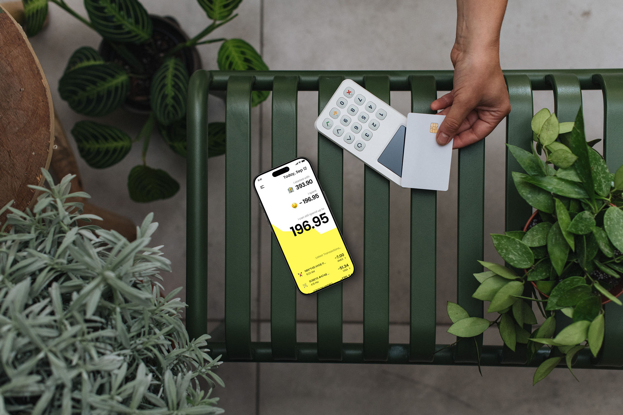
The yellow interface is a deliberate choice, not decoration. Every spending category carries an emoji (🍕 for dining, 🏠 for rent, 🎮 for entertainment) so a budget reads as a picture of how you actually spend. Tracking updates the moment a transaction clears, and the app nudges gently as a category nears its limit instead of scolding after the fact.
The UX strips out friction wherever it hides. Onboarding runs under 90 seconds. Linking a bank account is one tap through Plaid. The dashboard leads with the single number most people want, which is how much they can spend today without touching their goals; everything else is one tap away rather than crowding the screen.
We built Niya in React Native for iOS and Android on a Node.js backend. The point it proves is a small one that holds up: a finance tool can be easy to look at and still do the accounting, and that combination is what gets people to keep using it.